Digital Damage in India: Web Perils of Information and Broadcasting
By Rakesh Raman
When I hear Narendra Modi, who has managed to become the Prime Minister of India, parroting about smart governance, smart cities, digital India, information superhighways, and technology in general, I prefer to use earmuffs to shut my ears.
Why? Because with such useless rhetoric he is not only trying to fool the gullible in India, but he is also making a fool of himself – at least among the people who understand technology, as India is among the laggards in terms of tech adoption.
Politicians, however, are supposed to be bluff masters. And they are. Narendra Modi is no exception. Without understanding the fundamentals of technology and its applications, he is daydreaming – and in the process cheating Indians, most of whom are illiterates.
So, where does India stand on the tech front? In order to inform you about the government’s lies and reveal the truth about the sorry state of affairs in the digital or technology applications in the Indian government departments, I have started the “Digital Damage” article series.
In the “Digital Damage” series, I will write about the archaic information systems that the Indian government uses, its repulsive websites, defunct departments that are supposed to implement tech systems, and the primitive government officials who are at the helm of affairs.
[ Also Read: How “Make in India” Will Break in India ]
In this article, let me focus on India’s Ministry of Information & Broadcasting (I&B). Although I know most government websites are standing like dilapidated web ruins, I selected the I&B site for review thinking that people in the information ministry would have some respect for information. Alas, they don’t.
When I browsed through the web pages of the I&B site, it became difficult for me to count the number of tech as well as content flaws in it. As it was consuming a lot of my time to count the number of errors on the site, here I am highlighting some of the flaws which will give you an idea that how carelessly this site is being handled.
Content Flaws
Wrong Name of the Ministry
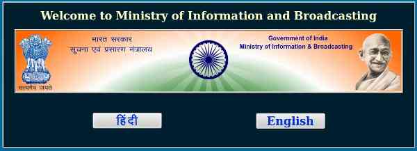
When you enter the site address (http://mib.nic.in/) in your web browser, the homepage of the site opens – which is reproduced in the image given below.
At the top of this image, you will find the name of the ministry written as: “Welcome to Ministry of Information and Broadcasting”. But immediately below this title, the same name is written as “ Ministry of Information & Broadcasting”. In the latter name, the word ‘and’ is replaced with the symbol ‘&.’
The English language rules suggest that normally ‘&’ is not supposed to replace the word ‘and’ while there are specific rules for using ‘&.’ But you can’t expect sarkari babus (government officials) to understand any language properly, let alone English, which is an alien language for them.
[ Also Read: Digital Marketing Simplified – How to Create Content ]
But the trouble is they are also careless. Even a donkey and a monkey would know that an error can be hidden from most eyes if it’s made consistently in a document.
The people in the I&B ministry would have easily used ‘&’ or ‘and’ at both the places in the name of the ministry. But they didn’t. And by the way, what’s the purpose of repeating the ministry’s name – one right below the other?
Language Confusion
Let’s move further. On the same homepage described above, you will find two language options – Hindi and English – to access the information on the site. Very good.
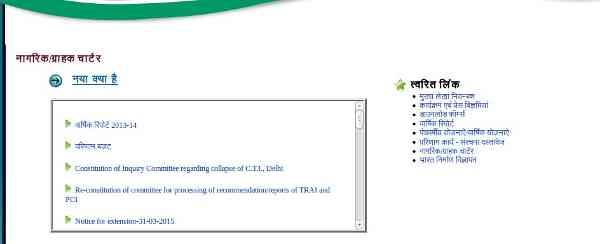
But when you press the Hindi button, a new page opens (image given below), which shows you text in Hindi as well as English.
Now even an illiterate man (and also a woman) will tell you that a person would press the Hindi button on the site, if they don’t understand English language. But even after choosing the Hindi language option, if the site visitor is shown English-language text, aren’t you confusing the visitor? This is all about common sense, which is not found commonly among government officials.
Wrong ‘About Us’
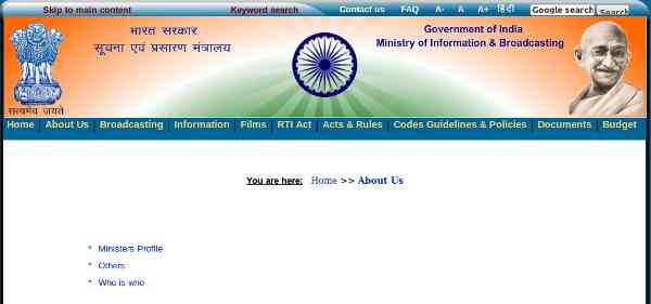
Now let’s choose the English language option and see the content under the “About Us” section. When you press the “About Us” link, a page opens (image given below) with three options: Ministers Profile, Others, and Who is who.
The option at the top is “Ministers Profile”. What are you trying to say? Do you know something about singular and plural rules of English language?
Actually, either it should be Minister’s Profile (with apostrophe ‘s’) if you are trying to put a single minister’s profile or it will be “Ministers’ Profiles” if you are going to cover the profiles of different ministers. Don’t you agree? Then why do you behave like buffoons?
Blank Pages
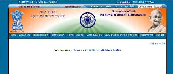
Incidentally, if you clicked the “Ministers Profile” link mentioned above, instead of showing you the profile of the minister, a blank page (given below) will stare you in the face.
Hello, the Ministry of I&B. Are you joking?
There are plenty of other content flaws on this site. But now let’s move to some of the tech flaws.
Technology Flaws
Faulty Search
Search is an extremely important feature of a website. It lets you search any keyword or a combination of words that appear on different pages of the site while you stay on the site.
But when you try to search on I&B Ministry’s site, it throws you out and you find yourself abandoned on Google’s site. Strange but true. It shows that the people who have developed this website are clueless about the technical aspects of a site’s development.
Squeezed Pictures
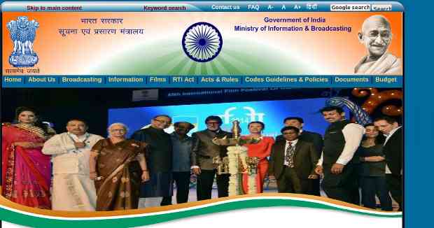
The site is carrying squeezed pictures of ministers and others. In the sample of a squeezed picture given below, a Bollywood actor who is over six-feet tall, looks like a virtual dwarf.
The site developers either don’t know about the photo-editing software or don’t know how to use it. As a result, shabby images continue to appear on the I&B Ministry’s site.
By using the software, you can edit a picture to the size that your site’s template demands. But who will teach all this to the people in the ministry?
Irresponsive Technology
When the web world has already evolved to deploy Responsive Web Design and mobile-optimized technologies for creating web properties that people can use on their mobile devices, the I&B Ministry is still stuck on obsolete design techniques.
Let alone mobiles, you can’t access the site even on your desktop because it lacks content and its design is terribly repulsive.
Defective UX
Of late, UX (user experience) design has emerged as a specialized field in the online content universe. Site developers use specific UX elements on their sites to attract and retain users’ eyeballs.
But it will be a foolishness to expect people connected with the I&B Ministry to have knowledge of UX when they can’t understand even the basic aspects of a website design.
In the indicative review of the I&B Ministry’s website that I have done above, I can understand that politicians and bureaucrats are supposed to be duffers, and they are duffers. One can’t expect them to be educated – and educated enough – to understand a complex subject such as the web.
[ Also Read: Meet the Uneducated Education Minister of India ]
But what about the so-called techies? Their livelihood depends on the tech work that they produce. Why can’t they learn and keep pace with the fast-moving tech world?
They won’t, at least in this case, because the government websites – including the I&B Ministry site – are created and managed by the National Informatics Centre (NIC), which is a dead government organization working with unskilled workers.
We will discuss about NIC separately, but for the time being you can read about it in this article that I wrote recently. [ Can the New Boss Moni Save the Sick NIC? ]
So, like it or not, this is the I&B Ministry for you – tired, retired, and finally crumbling – as it appears on its website.
It will always be better for the Indian government to pull down this website and put just an “Under Construction” message on it till the time the site gets revamped – with proper content and design.
“Digital Damage” will continue.
By Rakesh Raman, the managing editor of RMN Company
You also can read: More Articles by the RMN Editor, Rakesh Raman
Photos courtesy: I&B Ministry’s website

